Data Visualization
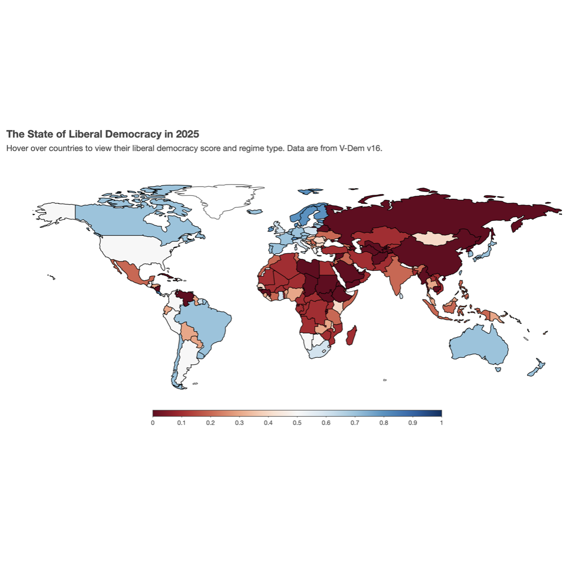
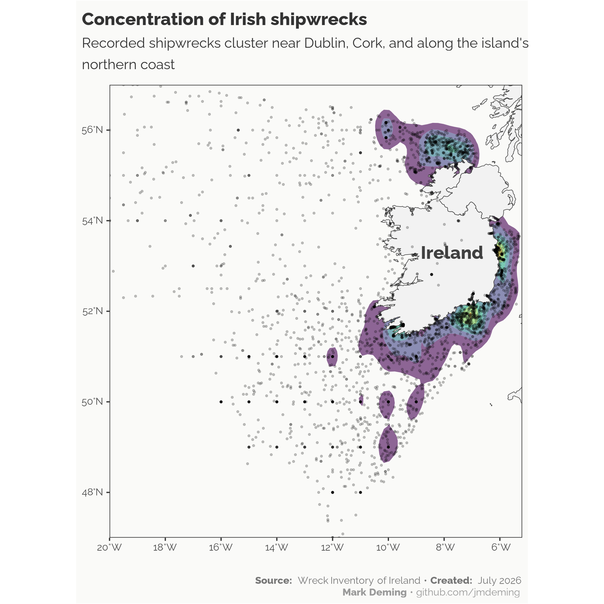
I create data visualizations that help make political science more accessible, engaging, and informative. My work combines principles of statistical graphics, interactive design, and reproducible research to communicate complex political data to students, researchers, policymakers, and the public.
Most of my visualizations are built in R using packages such as ggplot2, plotly, and the broader tidyverse ecosystem. Below is a selection of recent projects. You can also explore additional visualizations––including my TidyTuesday projects––on GitHub.